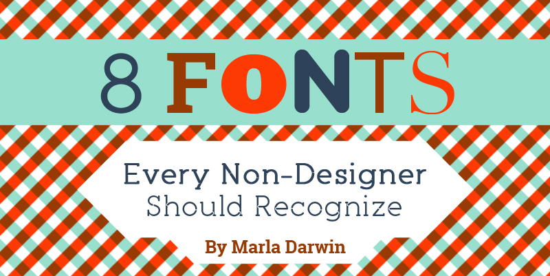
8 Fonts Every Non-Designer Should Recognize
Feb 17, 2015 • Marla Darwin
Feb 17, 2015 • Marla Darwin
I am not one of those people who insist the design will save the world, but I will say that does make the world a more functional and nicer place. My favorite cities in the world are the ones that have amazing urban planning and are a delight to walk in. Now if I were to break down what makes traversing through a place a more pleasant experience, it will usually be due to readable navigational graphics, prominent signs, and organized brochures! Break it down even further and you’ll realize that it’s great fonts that are the skeleton to these designs.
Here are some to get you started.

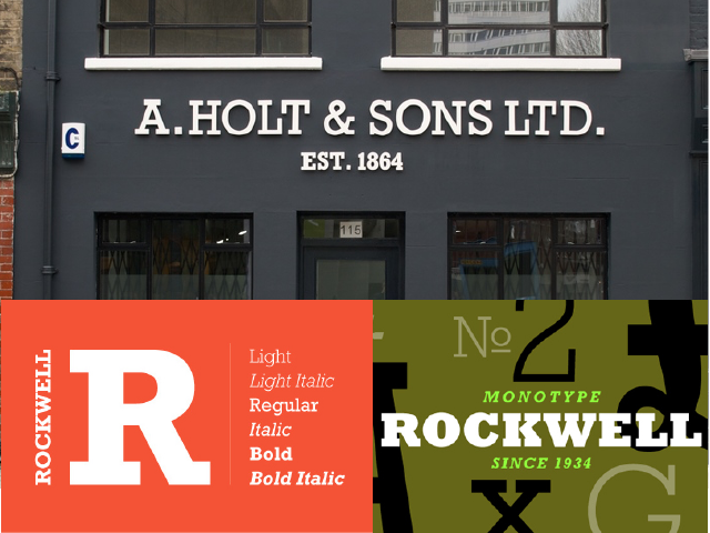
Rockwell is the most famous of the slab serifs, where the serifs are angular lines that match the weight of the letters. Designed in 1934 by the Monotype foundry, Rockwell showcased a different way of playing around with geometric forms. The result makes for fine signage and bold headers. The serifs give it a formal look, but the slab elements give it a friendly personality – perfect for restaurants, schools, and museums.
What it says about you if it’s your favorite: You love brunch, you love historical fiction, and you are not above dick and fart jokes.

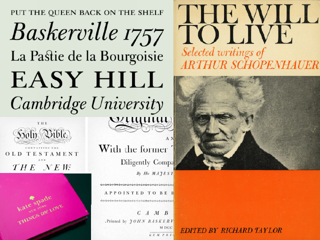
A research done a few years ago showed that Baskerville is the trusthworthiest font when it showed that people agreed with text written in it by 1.5% more. This is useful knowledge for anyone still in school and submitting term papers. Apart from that, Baskerville is also one of those fonts that have a rich history. Designed in 1757 by John Baskerville, the curvy shapes and graceful swashes have ensured that this typeface will always be an imposing feature on official documents. Just like with most great serifs, its refined beauty comes out when you use it in Italic.
What it says about you if it’s your favorite: You’re the type who’ll be miserable if someone laid out your tombstone in an ugly font.

From the other half of Hoefler Frerer-Jones (his company is now Hoefler & Co.), Jonathan Hoefler in 1994 designed this impressive boxing-themed type family that carries 32 weights. Because this is a solid sans serif font family that stretches from super duper skinny to ridiculously wide, it’s been a favorite for use in high impact materials. You can see this in a lot of museum graphics and elaborate magazine features because of its ability to squeeze and expand into any given area of space.
What it says about you if it’s your favorite: Your biggest secret is that you try to get away without showering and grooming as much as you can – and you do, because you manage to still smell good and to be the one with clever comebacks.

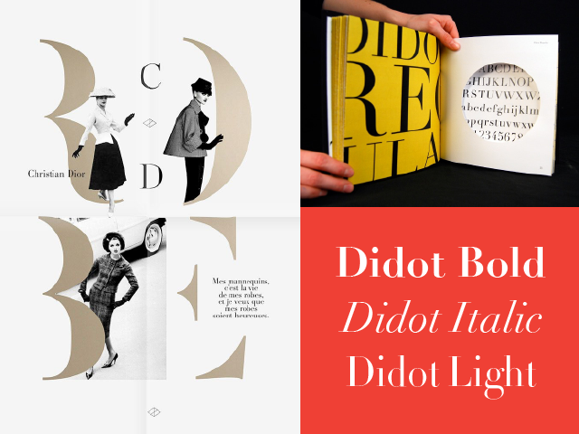
Didot is a name of an 18th French family that specialized in printmaking and lettering. It also refers to a font family developed by the same folks around that time. It features a contrast of thick and thin line elements that give it a sophisticated and stately look. It’s a go-to for making anything look stylish and fancy, hence being a favorite for the fashion industry. Didot’s italicized version pumps up the drama even more with its gorgeous swooping movements. Grab any fashion magazine and observe its many appearances on its covers and editorials.
What it says about you if it’s your favorite: Your wardrobe is your crown jewel for self-expression and if you’re not a dancer, you’re probably a frustrated one as well.

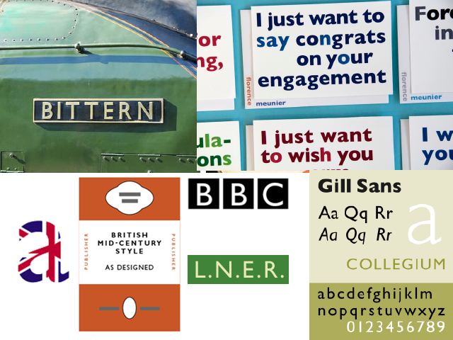
For British eyes only! Designed in 1926 by Englishman Eric Gill when a bookshop owner needed a sign for his shop. Gill was inspired by the lettering done on the London Underground logo (designed by Edward Johnston) and once he developed his own take into a full font font family, The London Railway picked up and started using it on all their materials. Gill Sans is a bright combination of modern and traditional elements that make it a good fit for advertising materials and for an aesthetic that looks both dapper and serious. Spot it on the BBC logo and the Penguin book jackets!
What it says about you if it’s your favorite: You’re easygoing and down-to-earth, but hate it very much when your pants aren’t pressed properly.

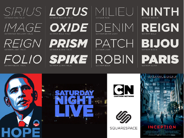
Many people believe that Gotham is the font that won the American elections in 2008. Featured prominently in Shepard Fairey’s iconic Obama campaign poster, this font also became the new classic for the millennial generation. Designed by American Tobias Frere-Jones (of the now defunct Hoefler Frere-Jones font foundry – read up on the controversial divorce, if you dare), Gotham has become the font of modern America. First commissioned by GQ magazine, Gotham was developed from the idea of something masculine, geometric, and approachable. Frere-Jones walked all over New York City and took pictures of various signs in the city as his inspiration – the final product can be now seen in the title cards for movie trailers, tv shows, and building signage.
What it says about you if it’s your favorite: People laugh really hard at your jokes but know better not to mess with you when you haven’t had your coffee yet.

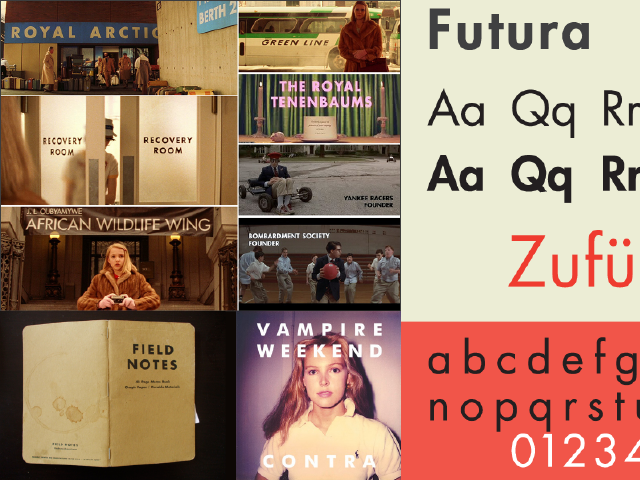
Wes Anderson’s and Stanley Kubrick’s favorite font! Designed by Paul Renner in 1927, Futura is a sans-serif font famous for its geometric features that echoed the Bauhas (an art school that pushed modernism and eschewed ornamentation) design movement that was going on at that time. The ‘O’ is a perfect circle and the capital ‘A’ is an almost perfect triangle. It has slender proportions that balance out the playfulness of the geometrics. In its lighter weights, it comes off as elegant, while the bolder ones showcase a youthful insouciance.
What it says about you if it’s your favorite: You’re a good little hipster who straddles the old and the new in perfect quirky fashion.

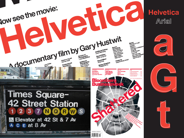
BMW, Crate & Barrel, Lufthansa, Post-it, The North Face – these are just some of the tons of brands that use Helvetica. When talking about fonts, we cannot start without mentioning Helvetica first because the award-winning documentary of the same name has made it a cultural force that embedded itself in our cultural consciousness. Originally named Neue Haas Grotesk, Helvetica is a Swiss font (“Helvetica” is the Latin name for Switzerland) that was developed in 1957 with the intention of being as neutral as it can be, being perfectly compact, and striking on signage. These traits allowed it to become a timeless global typeface that communicates ubiquity and reliability (the same reason why many hate it as well).
What it says about you if it’s your favorite: You hate it when people rearrange your stuff but you’re loved for being the predictable one in your group of friends.
Got anything to add to this list? Share them in the comments below!
Input your search keywords and press Enter.